Similar Articles
Dynamically Adapt Your Color Palette to Any Image 🎨
TL;DR
Automatically adapting your color palette to match any image can significantly enhance your site's aesthetic and user experience. With the right tools and a basic understanding of color theory, you can create dynamic, visually cohesive designs that stand out. Dive into the experiment and watch your project come alive with colors that sing in harmony with your images.
The Genesis of the Idea
Back in my second year post-bac, diving into the world of design (a venture with mixed results, to be honest 😅), I faced a major challenge: selecting and applying a cohesive color theme. This struggle led to an intriguing experiment: what if my site could adapt its color palette based on a hero section image, changing with every page reload?
While initial attempts were far from perfect, I eventually reached a stable solution and picked up several theming tricks along the way. Curious to see a polished version of this experiment? Check out my about page.
The color theory
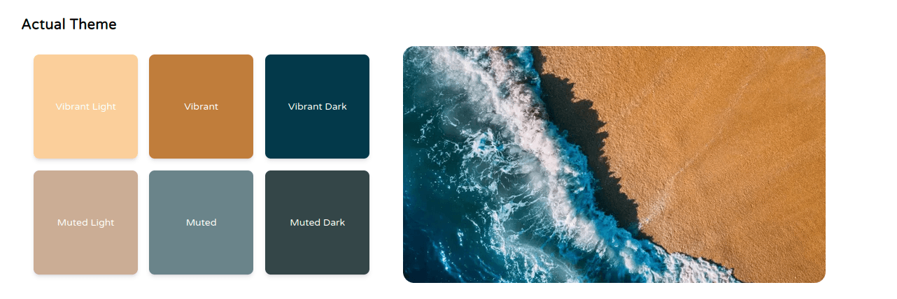
Color theory is a set of principles that helps designers understand how colors relate to each other. It plays a crucial role in creating visually appealing and harmonious designs. Here's how it can be applied to automatically adapting your color palette to any image:
1. The 6-color palette:
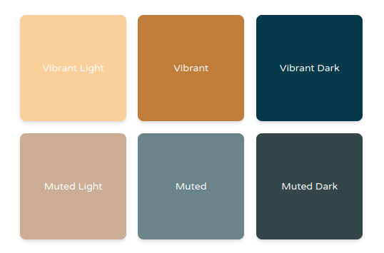
This approach utilizes six colors derived from the image:
- Vibrant-light: For highlights.
- Muted-dark: Ideal for backgrounds or text.
- Vibrant: Perfect for CTAs.
- Muted: Great for secondary elements.
- Vibrant-dark : for darker elements to add visibility.
- Muted-dark: Adds depth and contrast.
2. The 60-30-10 rule:
This rule suggests dividing the color usage on your page:
- 60%: This is your dominant color, typically extracted from the main image. It should be used most frequently for backgrounds, main content areas, or larger elements.
- 30%: This is your secondary color, often a contrasting or complementary color. It's used for emphasis on elements like buttons, titles, or headers.
- 10%: This is your accent color, usually the most vibrant or bold color from the palette. It's used sparingly for highlights, CTAs, or small details to add a pop of color.

Here we have : 60% :
vibrant-light30% :muted-dark10% :vibrant
3. CTA (Call to Action):
In your website, Identifying your CTA is vital. Ideally, it should stand out from the rest to draw attention and encourage user interaction. Vibrant or contrasting colors are often well-suited for CTAs. (Generally, you only want one or tow elements of your website to be CTA)
4. Flourishes:
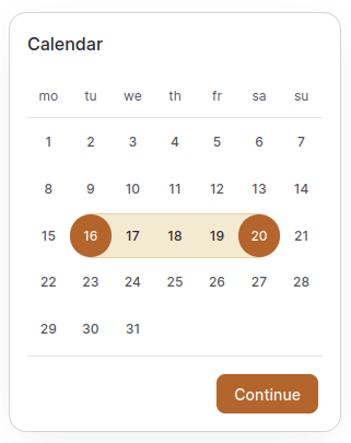
While the core palette focuses on the image's dominant colors, consider adding flourishes. These are subtle variations or complementary colors used for subtle accents or decorative elements. They can enhance visual interest without disrupting the overall harmony.
By understanding these color theory principles, you can automatically generate a visually pleasing and balanced color palette that adapts to any image, creating a cohesive and impactful design experience.

React Palette
Introduction
When building a visually engaging web app, dynamic theming and UI color harmony are key. Here's where Vibrant.js and React Palette shine, extracting stunning color palettes directly from images. While they share common ground, their distinct features cater to different development needs.
Features
- Color Extraction: Dive into images to pull out dominant color schemes.
- Customizable: Tweak extraction settings like color count or image quality.
- Versatile Applications: Perfect for dynamic web themes, UI color syncing, or sparking design inspiration.
- Ease of Use: Both libraries are straightforward to integrate into your projects.
- Performance: They deliver robust performance for most use cases.
- Open Source Freedom: Free to use and modify, opening up a world of creative possibilities.
Considerations and Limitations
- Maintenance: The dormant state of Vibrant.js raises compatibility and security concerns.
- Dependency Chain: React Palette's reliance on Vibrant.js inherits its maintenance challenges.
- Color Accuracy: Results may vary based on image specifics and chosen settings.
- Resource Intensity: Large images could strain your resources during color extraction.
Making the Choice
Between Vibrant.js and React Palette, your decision hinges on your project's unique needs and development environment.
- Vibrant.js: A solid pick for those seeking a flexible, Node.js-compatible solution.
- React Palette: The go-to for React web app developers, offering additional state management and hook integration features.
How to use it with Nextjs
1. Installation (Why & How):
-
Why: To empower your Next.js project to extract color palettes from images, we need a library to handle the heavy lifting.
- How: Let's install
react-paletteusing npm:
npm install react-palette - How: Let's install
2. Setup Global CSS (Why & How):
- Why: We need a way to define and inject CSS variables that will store the extracted colors. These variables will be used by Tailwind CSS to apply the colors throughout your application.
-
How: Choose your preferred approach for global CSS:
-
CSS-in-JS Libraries:
- Benefit: Offers flexibility and component-level styling. You can encapsulate styles within each component for better maintainability and reusability.
- Example with
styled-components:
import styled from 'styled-components'; const AppStyle = createGlobalStyle` html { --bg-img: url(${imgeUrl}); /* Adjust for your image path */ --vibrant: ${data.vibrant}; --muted: ${data.muted}; /* ...other colors from data */ } `; // Render AppStyle in your top-level component -
Global CSS File:
- Benefit: Provides a more traditional approach for defining global styles. May be simpler for smaller projects.
-
-
3. Integrate with Tailwind CSS (Why & How):
-
Why: We want to leverage Tailwind's utility classes and extend them with the dynamic colors extracted from images. This allows you to apply these colors easily throughout your project.
- How: Let's extend Tailwind's color palette:
// tailwind.config.js
module.exports = {
  // ...other configurations
  theme: {
    extend: {
      colors: {
        // ...other colors
        'dynamic-vibrant': 'var(--vibrant)',
        'dynamic-muted': 'var(--muted)',
        ...other dynamic colors
      },
    },
  },
};
4. Use Dynamic Colors in Components (Why & How):
-
Why: Now that we have the extracted colors stored in CSS variables, let's use them to style our components!
- How: Here's how to apply colors from Tailwind:
import { usePalette } from 'react-palette'; const MyComponent = () => { const { data } = usePalette(imageUrl); return ( <div className="bg-dynamic-vibrant text-dynamic-muted"> {/* ...content */} </div> ); };- Tailwind's
bg-dynamic-vibrantandtext-dynamic-mutedclasses use the dynamic CSS variables, applying the extracted vibrant and muted colors.
5. Handle State Updates (Why & How):
- Why: To keep the component's styles in sync with the extracted colors, we need to update them whenever the image or the extracted data changes.
- How: When you update
imageUrlor thedataobject, the component will re-render, and Tailwind will automatically pick up the new values from the updated CSS variables, reflecting the dynamic colors seamlessly.
- How: When you update
Additional Considerations:
- React Palette Maintenance: While React Palette works, be aware of its dependency on the unmaintained
node-vibrantlibrary. Consider alternative libraries for future projects. - Tailwind JIT: For dynamic color updates using Tailwind in JIT mode, ensure it's enabled in your
tailwind.config.jsfile. - Performance Optimization: Optimize image loading and color extraction processes to avoid performance issues, especially with large images.
- Alternative Global CSS Approach: If not using a CSS-in-JS library, create a global CSS file with CSS variables for the colors. Update these variables in JavaScript using the extracted color data from
react-palette.